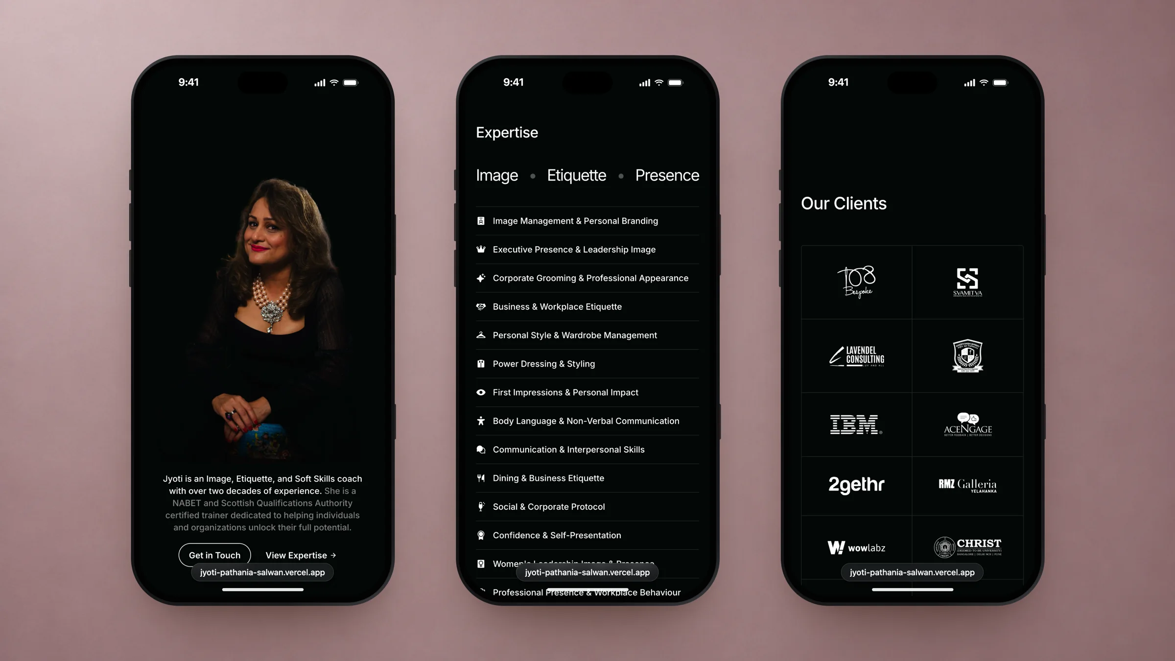
I let her presence lead. The site opens on her portrait, cut out against near-black, and one sentence in two tones: who she is in white, her credentials in grey. The rest stays as quiet: Inter in three weights, thin rules that hold both her client wall and her areas of expertise, and her three pillars, Image, Etiquette and Presence, set large on a single line.
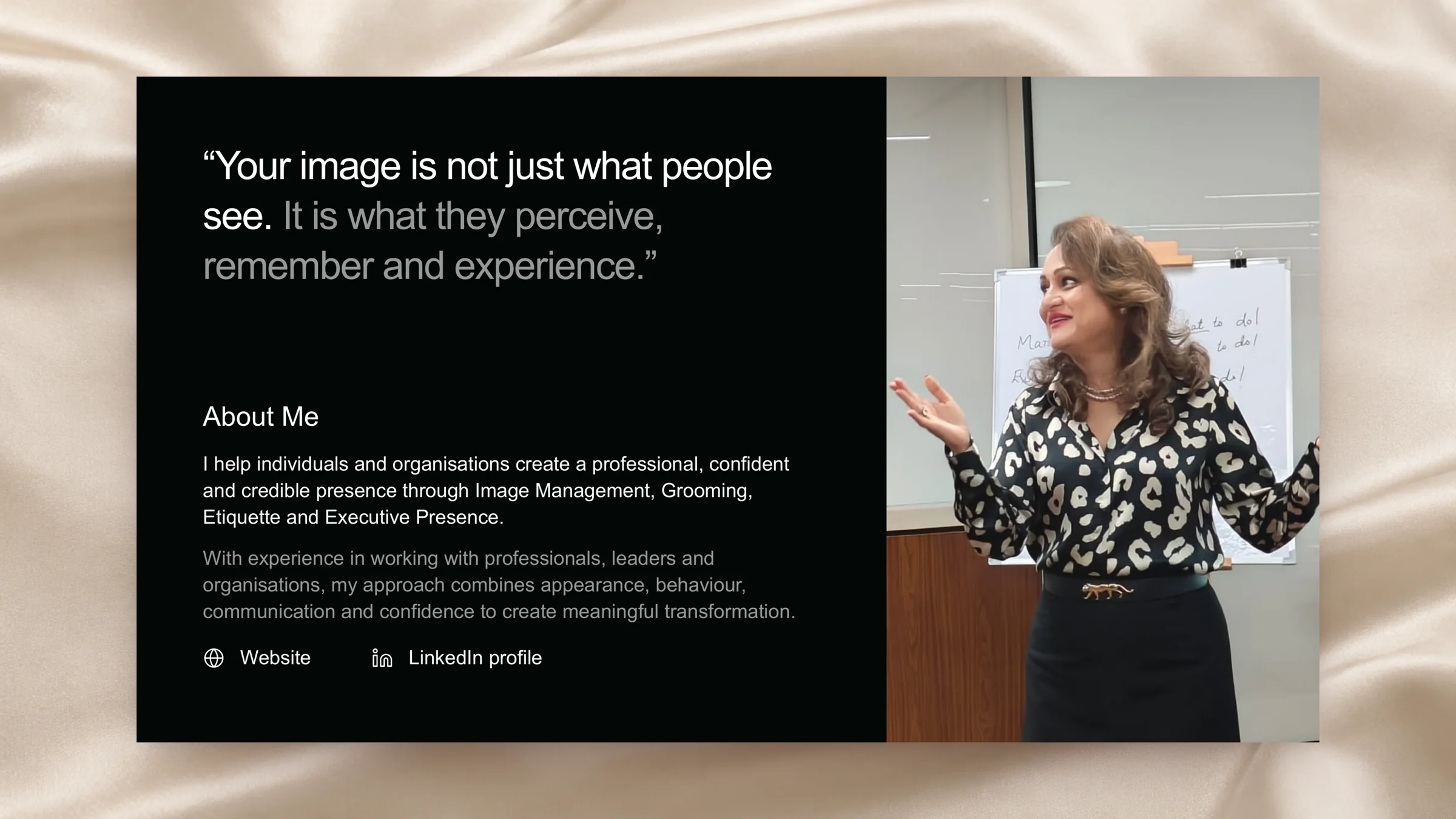
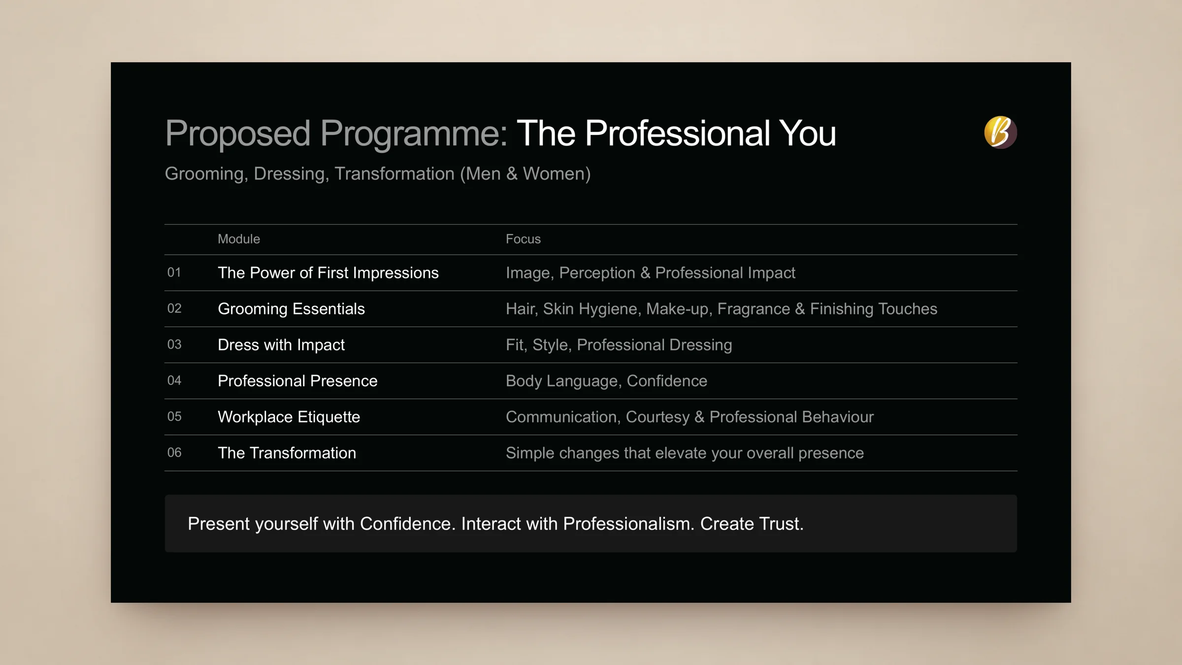
The finish is in the small things. Every client logo is set in white and sized by eye, so a bold wordmark and a thin script carry the same weight. Sections fade in as you reach them, the long expertise list stays in view until its last line is read, and one tap saves her contact card to a phone. When she needed a proposal for a prospective client, I rebuilt her deck on the same system, with her content as written, set in Arial so it opens the same on any machine. The site is live under her name, and the deck is an editable file she can keep using.