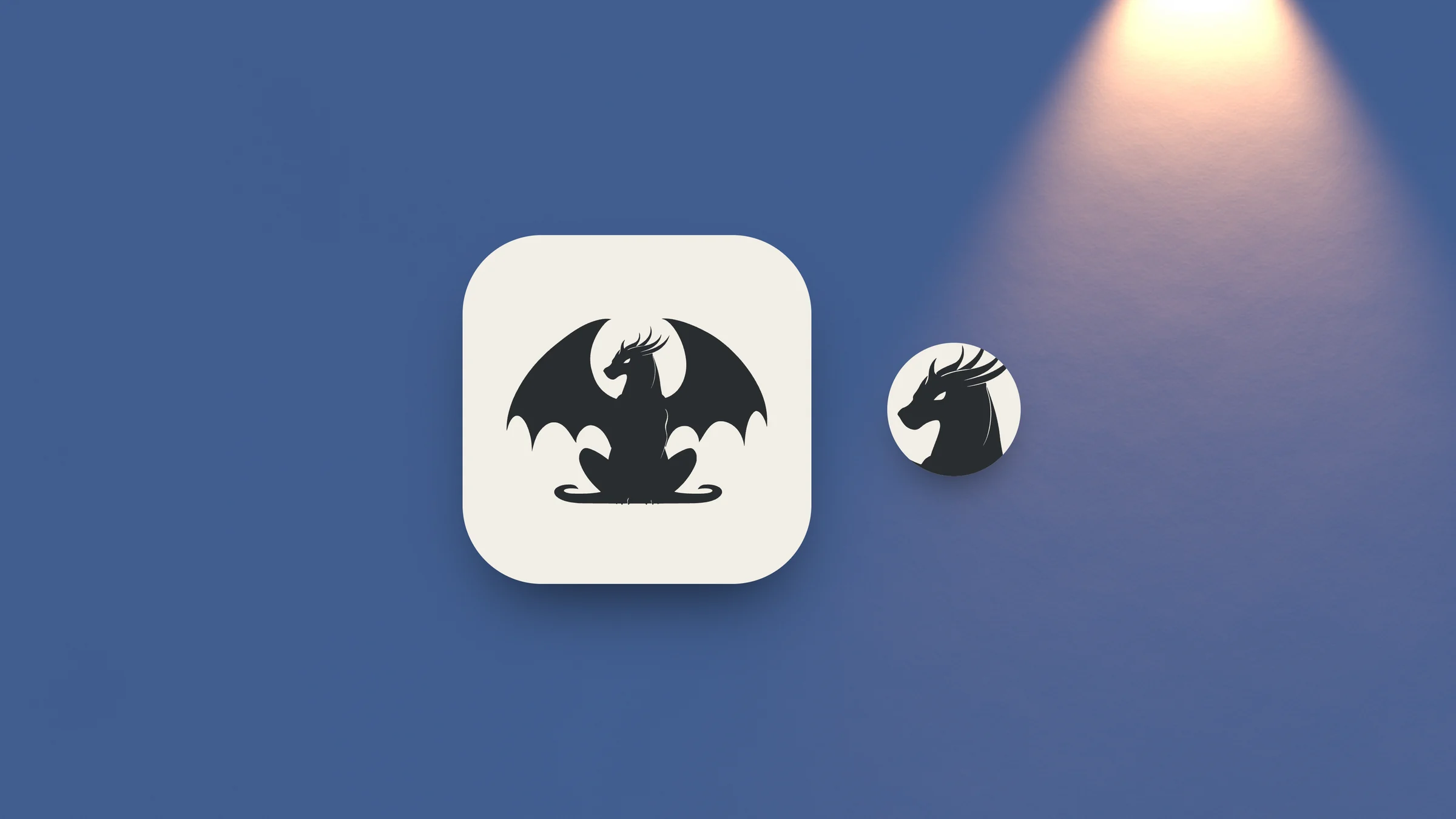
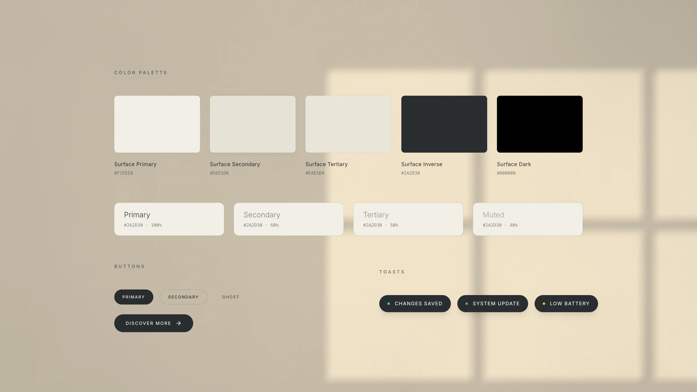
I took the name at its word. A gargoyle is the stone figure that watches over a building, so the mark is one: seated, its wings raised into an arch around an opening behind its head, cut as a single charcoal silhouette with one pale eye. It holds as an app icon and, cut down to the head, at favicon size. Two colours carry the whole brand, the mark’s charcoal and a warm cream.
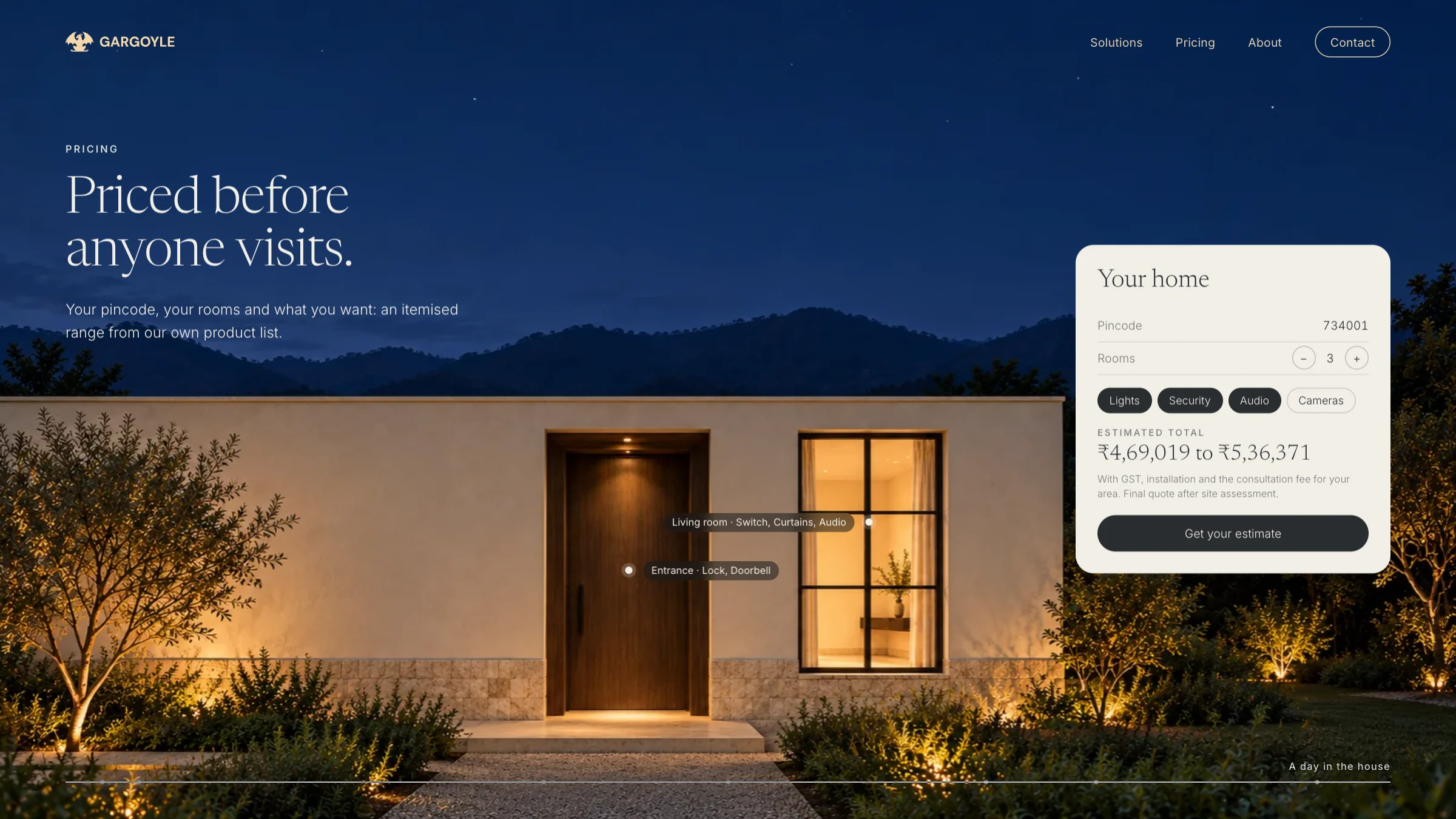
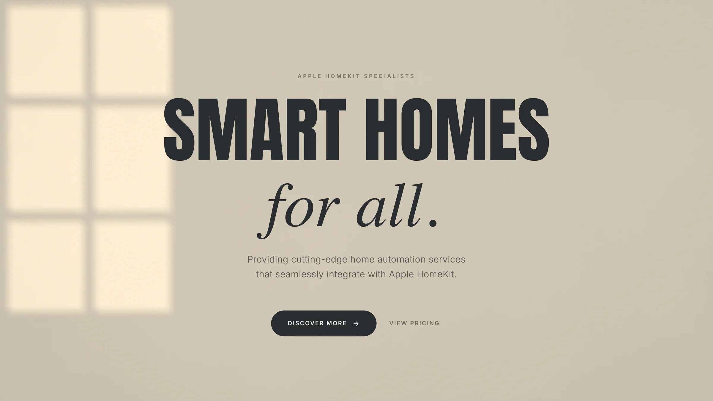
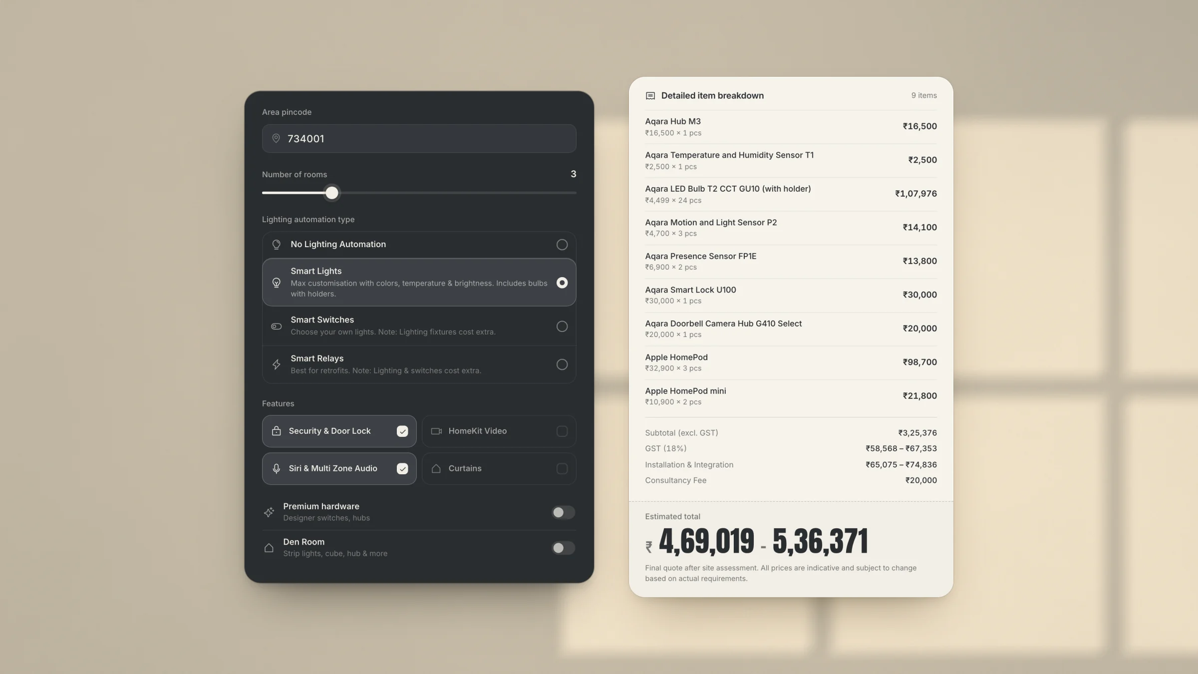
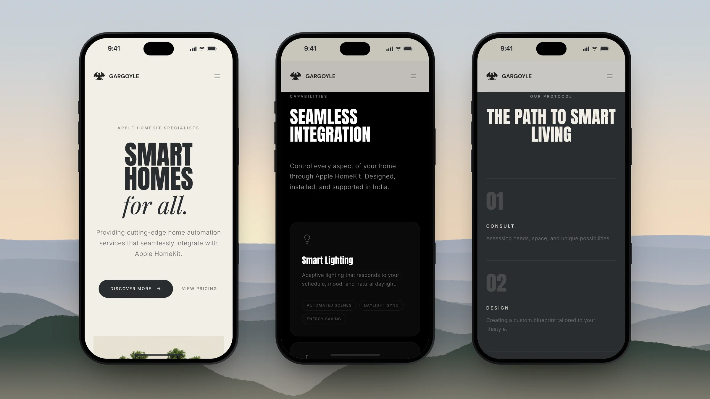
The website keeps those two colours and adds black, so its sections move between cream, charcoal and black. Headlines are set tall and condensed, with an italic serif for the human line, as in “Smart homes for all.” The pages walk through what a home can do, why everything runs in the Home app, and four steps from the first consultation to training and support. The pricing page answers the first question: a homeowner enters a pincode, the number of rooms and what they want, and gets an itemised range drawn from Gargoyle’s own product list, with tax, installation and the consultation fee for their area, and a plain note that the final quote follows a site visit. A design system page sits behind it all, so every new page is built from the same parts. The site is built and awaiting launch.
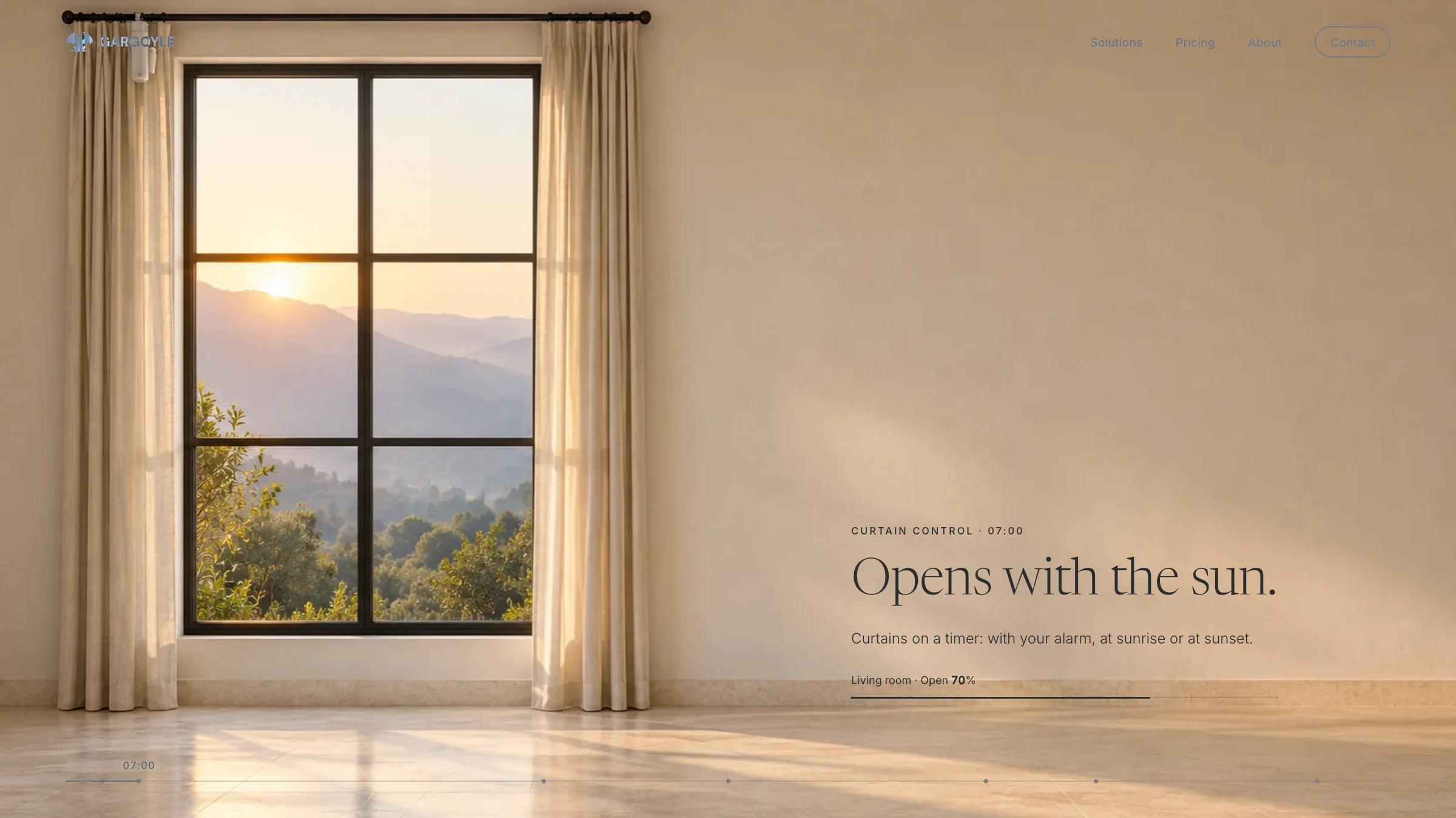
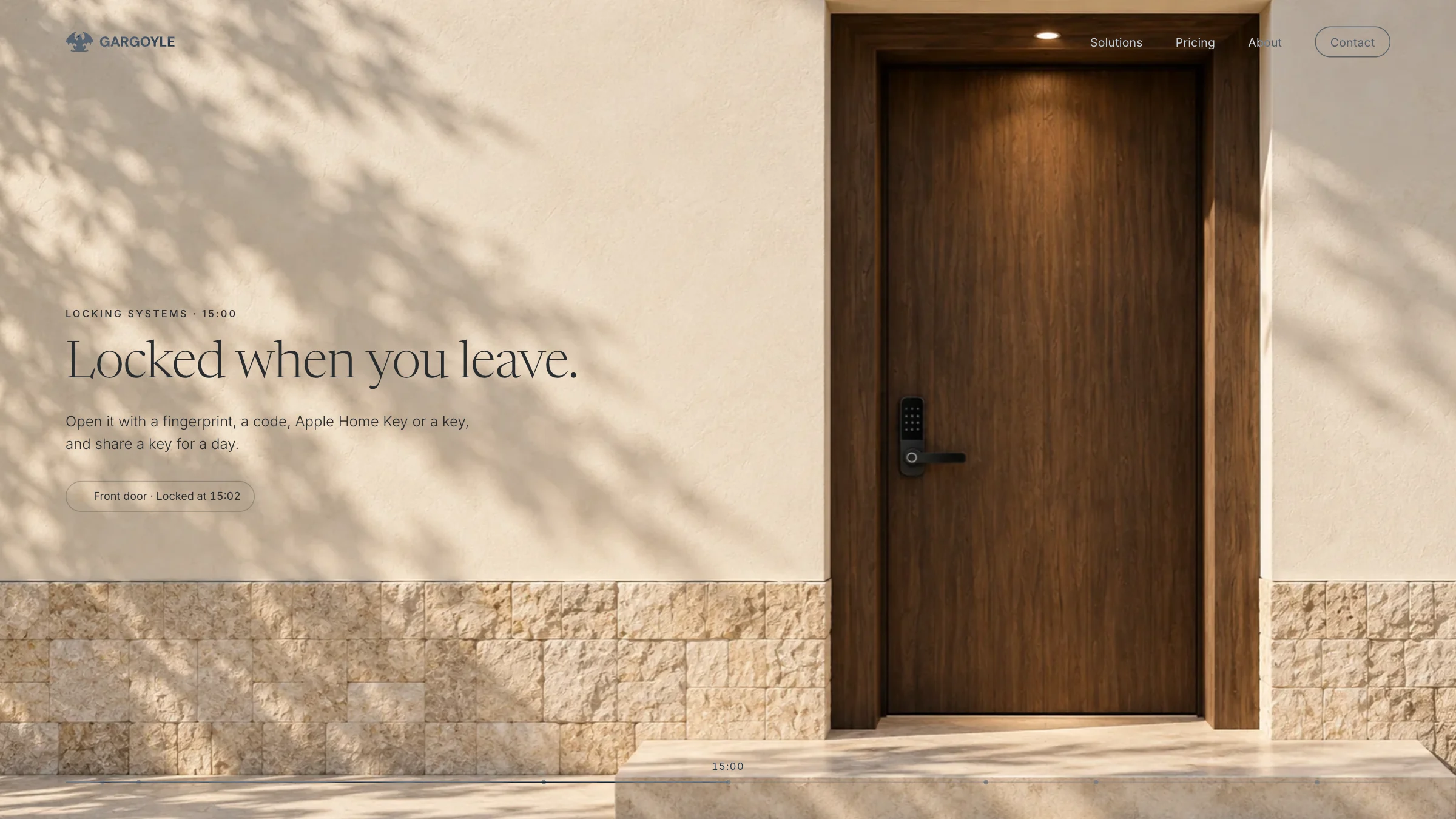
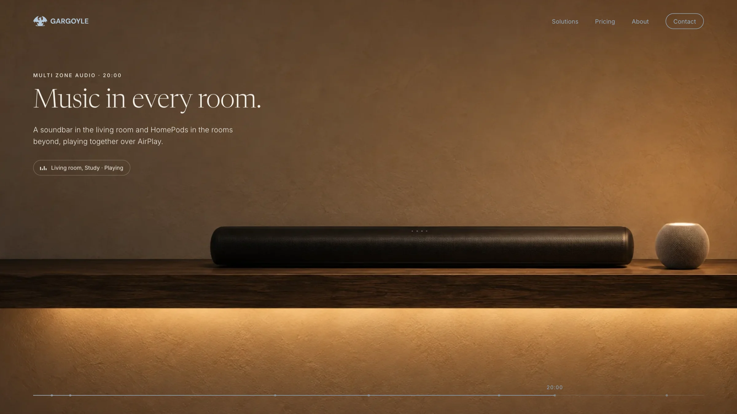
I have since explored where the site could go next: one house through one day, a different part of it in each section, the light moving across its walls as you scroll and each product shown at work. The curtains open with the sun, the front door locks, the corridor lights itself, and the day ends on the same estimate.